Creating a Modern Website: The Only Guide You’ll Ever Need
Edited by Lily Wu
People make first impressions off of your company’s website, and the last thing you want to do is to come off as cold and unapproachable.
Imagine you’re browsing through a company’s website. You see a cluttered interface with an unclear message. You find the text difficult to read. You get frustrated trying to navigate the sitemap, and the pages take forever to load.
Do you feel like staying?
If scrolling through your website is a headache, you’re losing people—fast. Even if you have a fantastic product, people won’t trust you if your website isn’t convincing. You don’t want your first impression to be your last.
In this article, we’ll tackle the essential ingredients to cook up an irresistible modern website. We’ll go over the aesthetics, the mobile-friendliness, and the expression of your brand voice so you can rise above the competition.
Table of contents
- Section 1: The Design
-
- Becoming minimalist
- Standing out from the crowd
- Section 2: The Writing
-
- Strip the copy
- Positioning yourself
- Finding your brand voice
- Using keywords
- Section 3: The Development
-
- Being responsive
- Being mobile-friendly
- Accessibility
Section 1: The Design
Becoming Minimalist
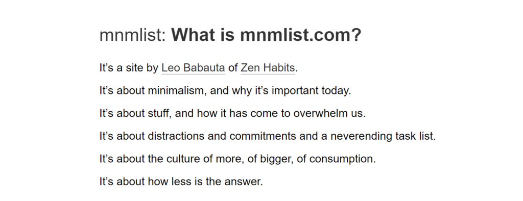
As tempting as it is, please don’t stuff your pages like Thanksgiving turkey.
People no longer have the patience to sit through anything that’s even remotely hard to digest, and it doesn’t help that you only have a few seconds to pique their interest.
The solution? Minimalism.
Your goal is to make it as effortless as possible to get your message across, to offer the path of least resistance. By reducing your website to its most essential elements, your visitors won’t have to hunt for the main message. It’s a win-win situation.
You also get these nifty perks:
- Quicker Loading time
- Increased responsiveness
- Easy maintenance
When designing a minimalist website, here are some things to keep in mind:
- Make it stupid easy for people to find what they’re looking for. Minimize the number of clicks it takes to get somewhere. Try not to make them scroll too much. Present the answer to their question in glaring bold so it’s impossible to miss.
- Choose a sleek font that speaks your brand image. Many modern websites use sans-serif typefaces (think Helvetica, not Times New Roman), but it’s not a strict rule. And try to avoid those fancy script fonts that make your brain twist.
- Stick to one or two colours throughout your entire website, ideally one(s) that reflect your logo. The consistency and exclusivity help people associate those colours with your brand.
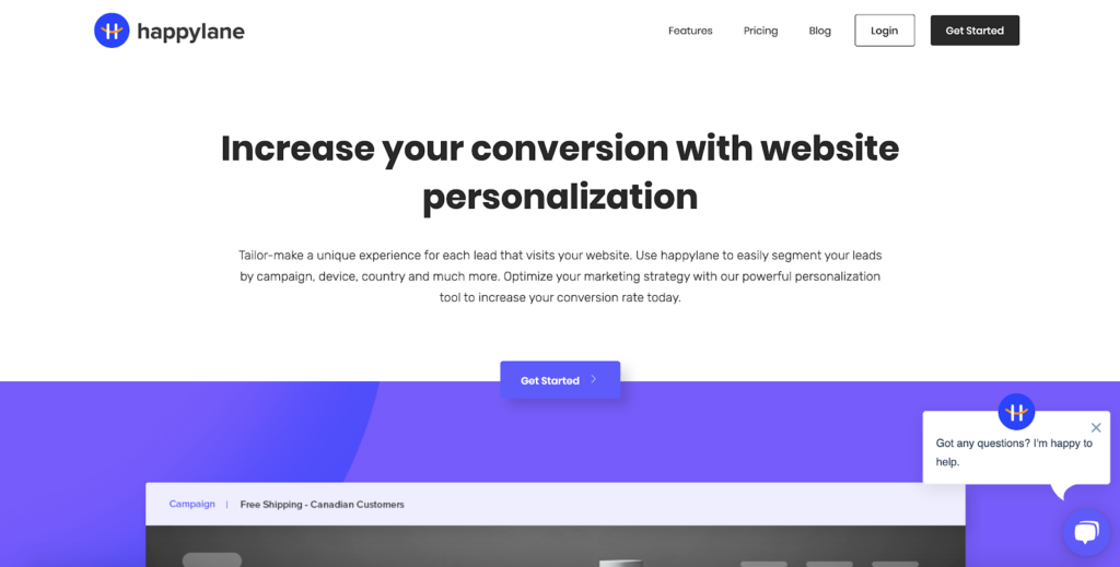
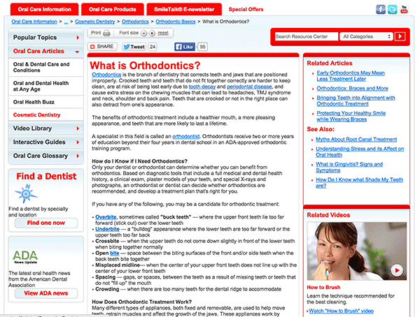
- Employ a flat design. Scrap realistic icons, gradient shadows, textures as well as any ornamental clutter, and replace them with something simpler.
Not flat:
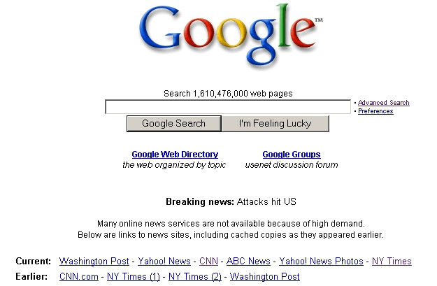
Flat:
- Learn to love negative space. They’re the empty areas that act as a breathing space for your audience, so your website doesn’t feel overwhelming and cluttered.
Little negative space:
Lots of negative space:
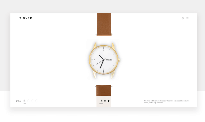
Standing out from the crowd
Now your website is a breath of fresh air, but is it unique enough to linger in your visitor’s mind?
The most memorable websites don’t blend in. They do the unexpected. And where there are already over 1.5 billion websites on the internet, doing the unexpected pays off.
Here are some ideas for you to create a website that goes above and beyond.
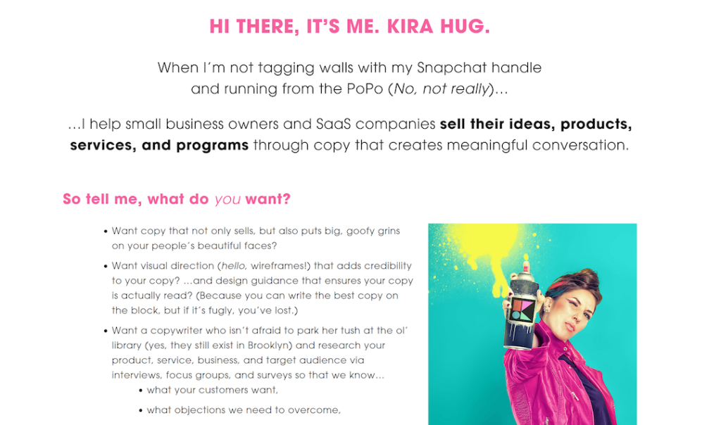
- Use a quirky voice. Having a flare of personality makes you look human. Take a look at Kira Hug’s freelancer website. Her text is fun and light-hearted, making it easy to feel like she’s a close friend rather than a salesperson after your wallet.
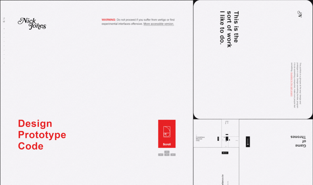
- Use an unconventional layout. Instead of opting for a traditional arrangement, Nick Jones took a more experimental approach. His website, narrowdesign.com, looks like the golden spiral, a stark difference from the usual top-to-bottom layout. Having a unique layout makes it harder to click off because you can’t help but be curious about it.
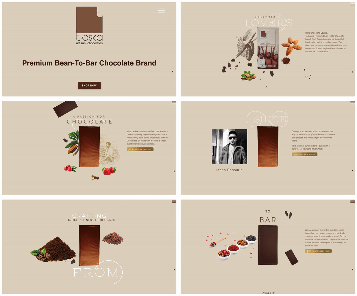
- Tell your story using visuals. Pictures are worth a thousand words, as the saying goes. If it takes too many words to tell your story, tell it faster using graphics. Toska chocolates does this elegantly, using animations to convey the journey of their artisan chocolate bar.
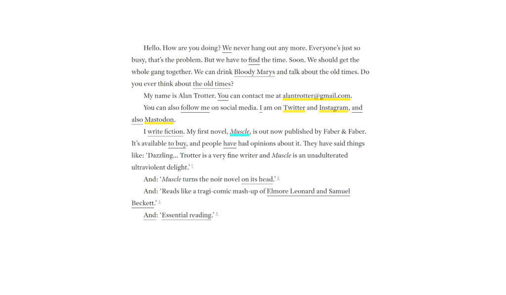
- Make it interactive. People love a game, so if they can have fun with your website, they’ll be too intrigued to leave. Alan Trotter’s website initial mystery caught my eye; his website was just eight little words on a blank page, four of them underlined. I quickly found out that as you click the underlined words, more appear, and it unfolds into a story. It’s definitely a website that’ll stick in my head.

Section 2: The Writing
Finding your brand voice
Before any writing happens, you need to decide what tone of voice you’ll be using. Many businesses make the mistake of skipping this step, and they end up sounding like those generic no-name brands. Boringggg.
So what is your company’s personality? Are you friendly? Professional? Quirky and colourful? Rebellious? Super chill and down-to-earth?
You might have something in mind already, but the biggest indicator of the voice that fits you best is your audience. Here’s what I mean:
- If you’re an engineer with extensive education and there’s a new tool out there for engineers, you’re going to expect some technical jargon.
- If you’re a teenager looking into skateboards, you might fancy some casual slang.
- If you’re a busy mom juggling two jobs, you’d appreciate something short and fluff-free.
Your target audience’s age, gender, profession, education, and personality all play a role in shaping your brand voice. Research how they talk, the little inflections and idiosyncrasies only they would recognize, and write them down. Do they prefer “buy” or “purchase”? What words do they love to throw around?
Then, when you inject these hints throughout your copy, it will feel familiar to them. You’ll seem like the type of company that truly gets them.
Writing the Copy
When you’re finished finding your perfect brand voice, it’s time to start writing. When you’re writing the text on your pages, especially your homepage, don’t just tell them what your product is. Convince them why your product should matter to them. In other words, create a value proposition.
A value proposition is the value you bring to your customers, the thing you stand for that sets you apart from the competition. Uber’s value proposition is that it solves all the annoyances that come with taxis. Microsoft Surface’s is that it’s “anything but ordinary”. It’s important that your copy clearly conveys your value proposition so people know exactly what you believe in as a company.
Here are the main components of a landing page:
- Headline: You have seven seconds to win people’s interest, so you want to convey your benefits in one attention-grabbing sentence. Don’t just tell them what your business does. Focus on why they should care about what you do.
- Subheadline: Your subheadline elaborates on your headline, convincing people to stay after your headline has caught their attention. According to Hubspot, your subheadline should explain some details, talk about the benefits, or encourage action.
- Body: Here, you might be compelled to explain the features of your product or service. But don’t expect your readers to figure out for themselves how these features will benefit them. Instead, ask yourself what they get out of these features, and write about that. For example, instead of saying you’re a website builder with an intuitive interface, emphasize how you can save them time and frustration.
- Call-to-action: These prompt the reader to do something, whether to learn more or to sign onto your email list. Use strong, actionable words that spark an emotion, such as “Plan your dream career today” or “Start your free trial now”.
Editing
If your reader is met with a wall of text, they’re noping out of there in an instant. Admit it, you probably do the same.
I can’t stress this enough. Shorten the sentences that can be shortened, or better yet, cut them out entirely. No one wants to read an essay. Don’t try to sound smart; that makes you appear less credible. Instead, switch complex words to their simpler alternatives.
Using Relevant Keywords
Without keywords, no one would be able to find you on Google. They’re the words or phrases people type into Google to find you or companies like you.
Tools like Google Keyword Planner can help you discover and research possible keywords. When researching, keep these two things in mind:
- Competition: How many other websites are using this keyword?
- Monthly search volume: How many people search for this keyword in a month, globally?
When you’ve chosen what word or phrase you’re going to use, include one or two of them in the following places. Don’t stuff your page full of these words—Google actually penalizes websites that spam keywords.
- Page Title
- Meta Description
- Header
- Sub Header
- Paragraphs
- Image Alt Tags
Section 3: The Development
Being mobile-friendly
More than half of your website traffic is coming from a mobile device. With different devices having different dimensions, resolution and bandwidth, your website needs to be able to adapt.
Since July 1, 2019, Google has been rolling out it’s mobile-first indexing, which will rank websites based on their mobile version instead of the desktop version. So if your website isn’t mobile-friendly, you can say goodbye to your Google search rankings.
One way to test if your site is mobile-friendly is by checking how responsive it is to the device it’s being displayed on. You can check this by narrowing the window on your desktop and seeing if your website adjusts to the changing sizes. Alternatively, you can use a free online tool like Google Search Console.
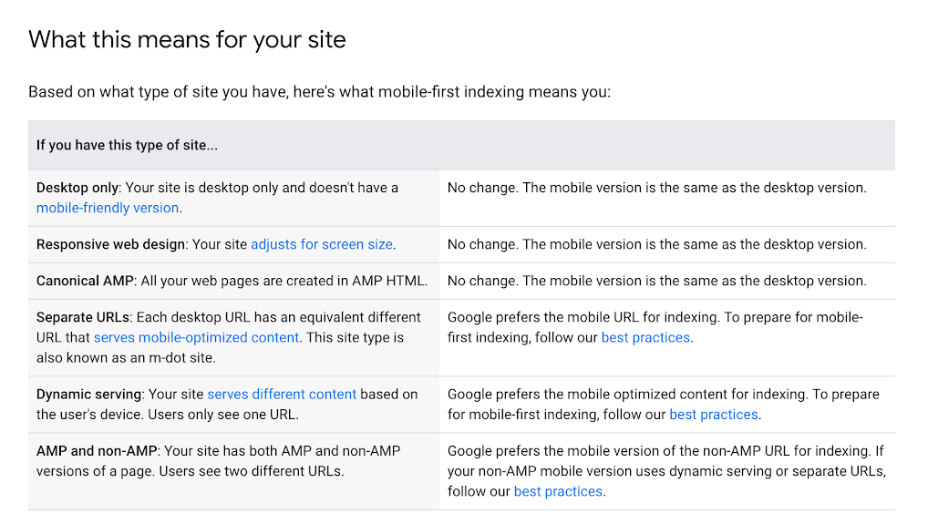
Having a responsive website is step one towards a mobile-friendly website. Here’s what Google says about the different types of mobile-friendliness.
Accessibility
Websites nowadays are built to be accessible to people with disabilities. In fact, Ontario has made it mandatory for public organizations and private/non-profits with 50+ employees to make their website accessible starting in 2021.
You can make your website accessible by:
- Choosing a content management system (CMS) that supports accessibility: A good CMS like WordPress or Drupal can be a key player in moving towards an accessible website.
- Writing alt text for images: Alt-text helps visually impaired people that rely on text-to-speak software to use the internet. It gives a short description of the images on your website.
- Making sure your website is keyboard-friendly: For people who are visually impaired, they will use their keyboard to navigate your site instead of a mouse. Make all your links and pages accessible by keyboard so they can easily navigate your website.
- Using headers correctly: Making sure to use proper heading hierarchy (h1, h2, h3…) makes it easier for text-to-speech programs to determine the structure of your copy. Don’t use bolded text as a replacement for a heading, and avoid skipping heading ranks (going from h2 to h4).
- Choosing your colours carefully: For colour-blind people, it’s sometimes difficult to differentiate between two different colours. Since most colour-blind people have red-green colour deficiency, try not to use the colours red and green to signify different things on your website.
Conclusion
Creating a website for today’s hectic world isn’t an easy feat. Even when you’re done the design, writing, and development, you’ll still have to maintain your website continually.
Nevertheless, your website serves as the face of your company, and it’s often where people make their initial judgements about what kind of company you are. It’s imperative that you send across the message you want to be known for.
If you’ve enjoyed this article, feel free to reach out to me at benb@thousand.plus if you have any questions and about developing your website. If you liked this article and are still hungry for more, subscribe to our mailing list (below) to get the best tips and tricks on web design.


