
4 Science-backed Issues In Your Nonprofit Website You Need To Fix
You know that your website is costing you donations, right?
Well, maybe not you specifically. But research points to a concerning reality: most nonprofit websites are littered with issues. Just take a look at these statistics:
- The biggest donation killers for 47% of nonprofits were usability problems relating to page and site design, including unintuitive information architecture, cluttered pages, and confusing workflow
- 43% have missing or unclear vital information
- Only 35% of nonprofits said their website was effective at growing their mission
- 17% make it difficult to even find the donate button!
The truth is, when it comes to website performance, nonprofits are lagging behind. It’s now 7% more difficult to donate to a charity site than to buy a product on an e-commerce site, and for non-monetary contributions, it’s even worse.
Pretty concerning numbers given that online donations are growing fast, and will take up the majority of donations by 2020.
That’s why if your nonprofit is stagnating, or you’re not getting the return on investment you’re hoping for, improving your website is one of the best investments to drive growth.
In this article, I’ll go over some major issues that may be costing you donations, such as:
- Having an unconvincing first impression
- Making it hard to find your basic information
- Not being mobile-friendly or mobile-responsive
- Having usability or design issues
Get an instant, detailed report of your website and uncover everything that's wrong with our complimentary website assessment. It's free and fast
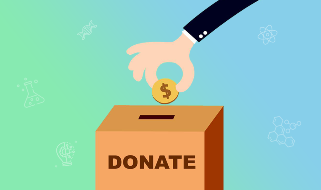
Your First Impression is Unconvincing
“Non-profits must clearly communicate their value proposition if they want to attract volunteers and online donations. Sadly, such communication is the sore point in the non-profit user experience.” — Nielsen Norman Group, Non-Profit Organization Websites: Increasing Donations and Volunteering
When you’re researching whether or not to buy something, you’re asking questions like “Is this worth my money?” or “How does it compare to its competitors?”.
For potential donors, it’s no different. If you can’t assert why your cause is worth caring about, or whether you’re making an impact, you’ll lose skeptical first-timers in seconds.
In fact, those first few seconds are paramount to determining whether someone will leave in an instant or stay for a long time.
How the Rate of Abandonment Decreases Over Time
Researchers at Microsoft revealed that the time spent on your webpage follows a negative ageing pattern. In other words, the longer they stay on a website, the less likely they are to drop off. But it also means that many people don’t make it past the first ten seconds.
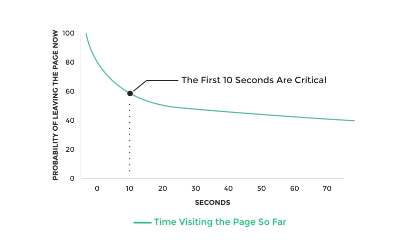
This also suggests that people initially scan the web page to determine whether or not it’s worth their time. Most pages fail the test, so they leave within a few seconds. But if the website can establish its value early on, people stay for a little longer. The effect is even more pronounced on less entertaining pages, where people are stricter in their ruling.
That’s why your first potential weak point stems from your first impression. If people can’t last 30 seconds on your website, you’re losing people who, had they been convinced to explore a bit longer, might’ve converted into donors or email subscribers.
Establishing Value Gets People to Take Action
The majority of nonprofits don’t tell you why they are valuable right off the bat. Take World Vision, for example. Instantly, the page assumes you’re ready to make a donation, prompting you to look through their gift catalogue and make a purchase. But are you really? What if you don’t know enough about the issue to deem it worthy of a donation? Or what if you’re doubtful your donation is going to make a difference in the world?
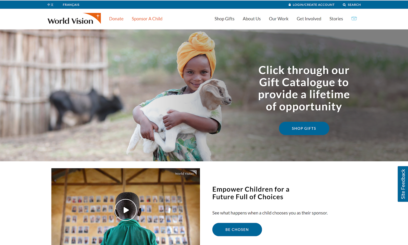
The problem with this and countless other web pages is that it doesn’t establish value before asking for something from the user.
Indeed, an experiment by Next After found that by simply adding a value proposition on their donation page, they were able to increase their conversion rate by 150.2%!
Giving a reason to stay and take action before you display a call-to-action is far more effective than just telling them what to do. When you answer the “why” before the “what”, you’ve got a better chance of convincing people you’re a worthy organization to contribute to.
People Can’t Find Your Basic Information
“Non-profits would collect much more from their websites if only they’d clearly state what they are about and how they use donations. Our new usability studies revealed considerable frustration as potential donors visited sites and tried to discern various organizations’ missions and goals — which are key factors in their decisions about whether to give money.” — Neilsen Norman Group, Donation Usability: Increasing Online Giving to Non-Profits and Charities
Now let’s tackle the actual content on your website. What do people actually want to see before making a donation?
Nielsen Norman Group set out to answer this question by observing people as they picked between two charities to donate to. Pairs were categorized into 11 categories — 23 websites in total — and both charities had roughly similar missions.
When asked what they wanted to see on nonprofit websites before donating, participants’ answers fell into four broad categories, two of which were the most frequent:
- The organization’s mission, goals, objectives, and work.
- How it uses donations and contributions.
But when researchers actually observed their behaviour, they noticed that people prioritized the organization’s mission and work much more than how they used donations. Indeed, the former point was 3.6 times more important than the latter.
Looking at the websites themselves, however, they found that only 43% of websites satisfied the first point on their homepage, while a staggering 4% addressed the second.
Simply stating what your organization does on your homepage can put you ahead of over half of nonprofits with a website.
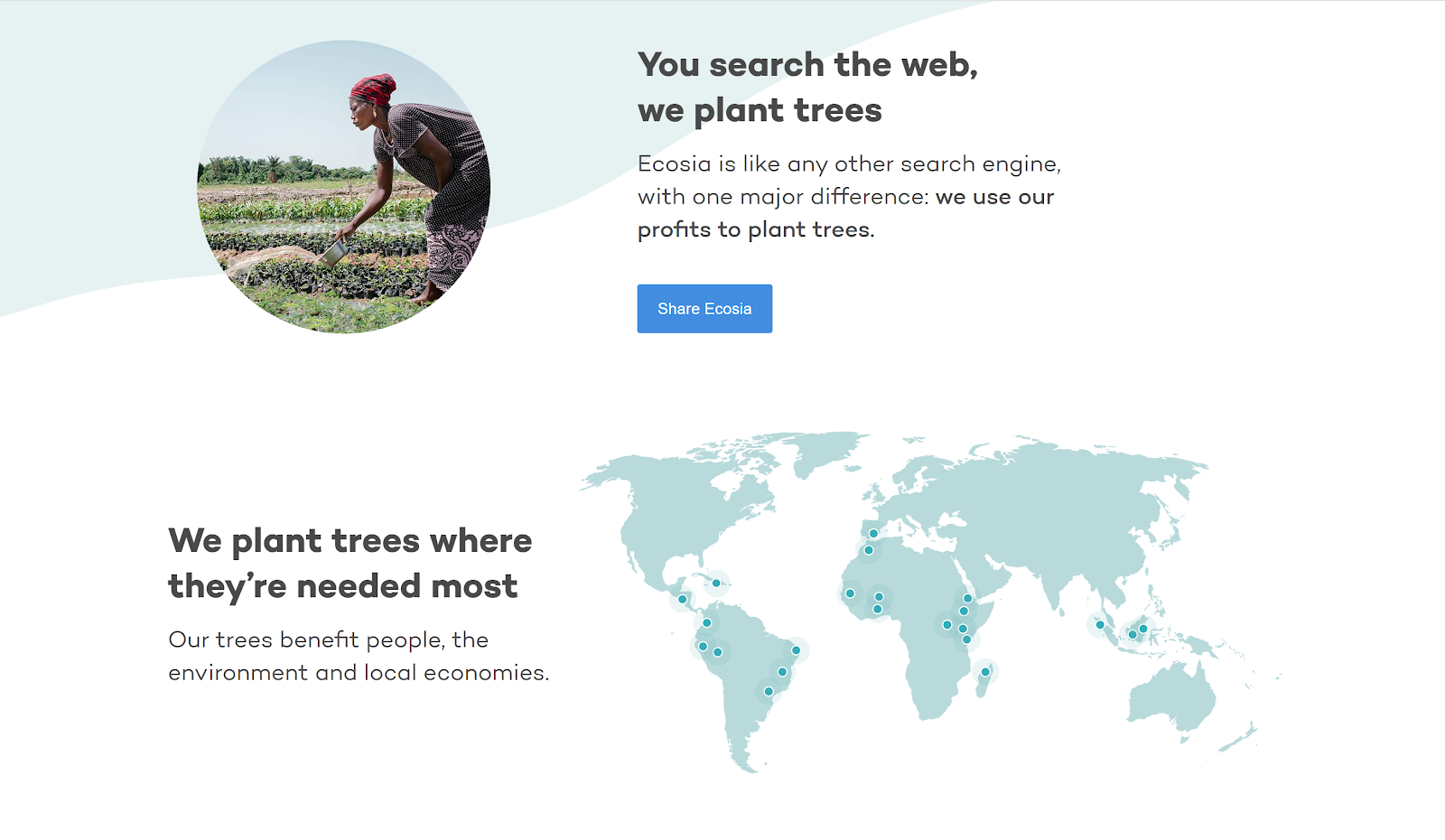
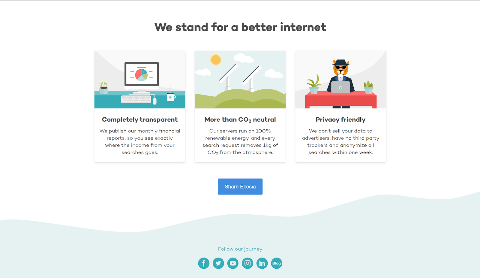
Take a look at Ecosia, for example. They couldn’t have stated their mission more clearly: “You search the web, we plant trees”. Further down, they link to their monthly financial reports, which clearly show you where your money is going. Although people don’t donate to Ecosia — they search the web — a prospective Ecosia user knows exactly where their contribution is going.
It Doesn’t Work on Mobile
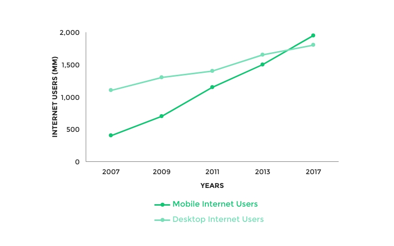
Making your website mobile-responsive is one of the most effective investments you can make with your website. More and more, businesses and organizations are beginning to notice the growing importance of going mobile-friendly. The statistics speak for themselves:
- In the past year, mobile giving donations have increased by 205%.
- By incorporating mobile-responsive design to their websites, nonprofits can increase their donations by 126% on average.
- 76% of Millennials find navigating nonmobile-friendly sites to be their biggest pet peeves towards nonprofits.
- 51% of people who visit a nonprofit’s website do so on a mobile device.
- 1 in 4 donors use mobile devices to discover nonprofits they were previously unaware of.
- 25% of donors complete their donations on mobile devices.
Even Google couldn’t ignore the rapid dominance of mobile. On July 1st, 2019, they implemented mobile-first indexing into their algorithm, causing websites that weren’t mobile-friendly to plummet in SEO ranking.
The benefits to reap are astounding, but nonprofits have been slow to adjust. A 2015 survey by Nonprofithub revealed that 47% of nonprofit websites still weren’t responsive, and 12% didn’t even know what it meant. That’s a concerning number given today’s digital landscape.
If you’re one of those 12%, don’t panic. The terms “mobile-friendliness” and “mobile-responsiveness” are often used interchangeably, so I’ll clarify some definitions here:
- Mobile-responsiveness: Your website adjusts to the dimensions of the screen. No component is cut off. Pictures shrink to fit the screen, but the font size and buttons stay large so the user experience isn’t compromised.
- Mobile-friendliness: The design looks the same across all devices. The content shrinks to fit on smaller screens but people may need to zoom in to read the text.
To see what a mobile-responsive website looks like, take a look at the website below. Notice how the components rearrange and resize themselves to fit the smaller screen without compromising usability.

So how do you make your website mobile-responsive? Some things like turning off autocorrect for forms or enlarging buttons can be easily done with no experience. But for things that are more complicated such as adding mobile specific features, consider hiring a web agency. (Psst. We’re a web agency that you might be interested in!)
Your Design is Unintuitive and Inconsistent
“Fixing a process with even minor usability problems might increase donations by 10%. For a non-profit with a $10M budget and an average share of online donations, such minor tweaks could mean an extra $100,000 per year.” — Nielsen Norman Group, Donation Usability: Increasing Online Giving to Non-Profits and Charities
Finally, let’s talk about design. It’s no question that an ugly layout makes your nonprofit look bad. When it looks like you’re not putting effort into your website, who says you’re not treating your organization with the same lack of effort?
It’s a good idea to run your website through a web assessment tool (Check out ours here!), or figure out how many clicks it takes to get from one place to another. But there are a few issues I’d like to bring light of: the unnecessary difficulty in the donation process, and the inconsistency between national and international websites.
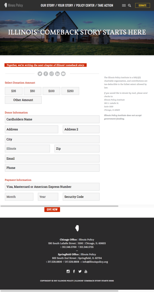
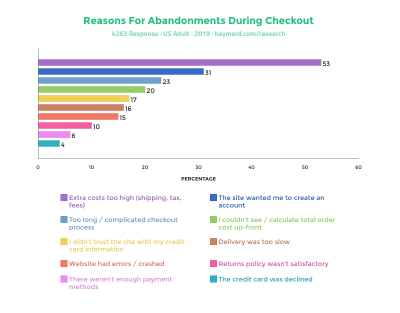
Let me go back to the fact that 17% of nonprofit websites make it hard to find the donate button. These people are ready to donate, but give up because the process is too hard. According to the graph below, you might be losing a huge chunk of potential donors simply by making users sign in!
For international nonprofits, many have issues with creating a unified design across international and local websites. Nielsen Norman Group even described them as looking “completely different than the master sites, even violating such elementary brand guidelines as using a consistent colour scheme.”
This inconsistency can be confusing and it makes you appear less credible. To combat this, it’s helpful to create a guideline for what the design should roughly look like, outlining colours, fonts, your brand message, etc.
Your Website Isn’t an Expense. It’s an Investment
It’s important to look at website improvements and redesigns through the lens of ROI. What are you losing out on when you choose to not do things making your website mobile-friendly?
I’ve outlined here four crucial elements nonprofits often neglect that bring massive returns:
- Defining your value proposition early on
- Clarity and accessibility of basic information
- Mobile-friendliness and responsiveness
- Design and usability
What you do with that information is up to you. But if you’re considering redesigning your website, you might find our website redesign checklist helpful.
Looking for a web agency or need a one-on-one website assessment? Come chat with us! We don’t bite. Promise. 🙂


